
Hi it is Heidi


Hi everyone, Heidi here again: today I’ll show you my second project as a guest designer for Kennedy Grace Creations!

Today I will show you how to make three cards with the same design but every card has a totally different feel because of the different papers I used to color the stamped image on. This way you can stretch the use of the craft supplies you have to get a variation of different results. These cards mainly feature the Time to Blossomstamp set, as well as one of the sentiments from the Graces Little Notestamp set, both from Kennedy Grace Creations, and also the thank you sequin mix called Kennedy Grace” that you get free with purchase.

For my first card I stamped the flower image from the Time to Blossomstamp set on Canson Bright White heavy weight cartridge paper Versafine Onyx Blackink and I coloured the image with Faber Castell Polychromos.

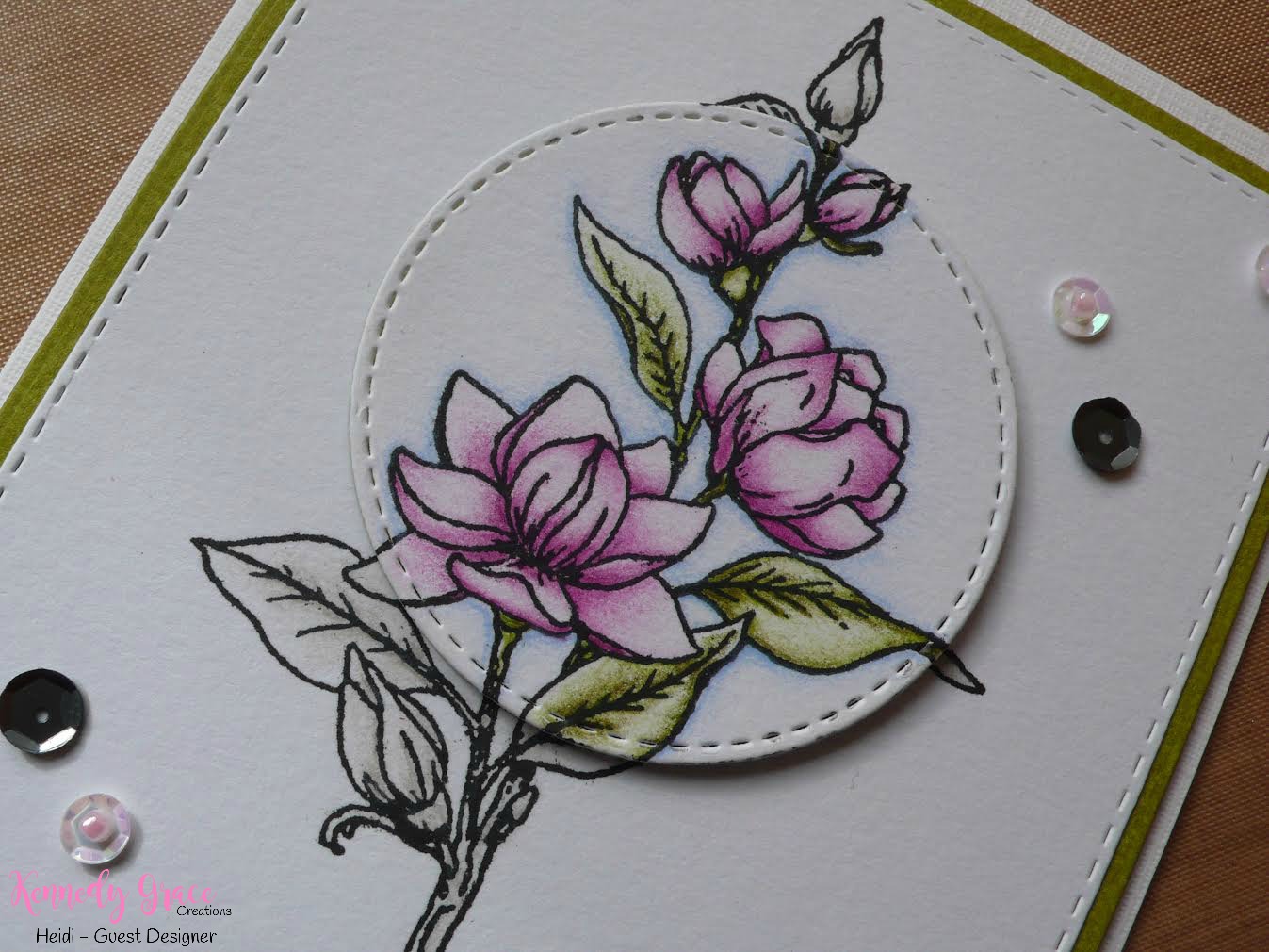
As the final finishing touch for this card I used the sequins (black and iridescent pinkish white) and the micro-beads (iridescent pinkish white) from the free with purchase Kennedy Gracesequins mix.

For my second card I went through the same steps as with the first card but I stamped the flower on Strathmore Toned Graypaper. This creates a totally different feel I think. I colored the image with mainly Polychromos and an odd Holbein and Caran dDache Luminance pencil. The sentiment for this card is from the Graces Little  NoteStamp set.

And for todays last card I stamped the flower image on Strathmore Toned Tanpaper with Mementos Espresso Truffleink and colored with Polychromos and Caran dAche white. I wanted to do something different with the sentiment on this card so I stamped one of the sentiments from the Time to Blossomstamp set with Versamark ink and heat embossed with Ranger super fine detail Goldembossing powder.

I have to say I just love the font the sentiments in this stamp set come in and this flower was a lot of fun to colour!

If you are used to only coloring on white paper then its fun to try something different sometime. What you have to keep in mind is that when you color on grey or tan paper that you have to think in reverse: you accentuate the highlights with a lighter (for example white) pencil unlike when coloring on white paper where you leave the highlights the color of the paper.


If you would like to know more about how I made these cards and what exact colors I used then you can go over to my website for more details:  http://www.makeyourlifecolourful.com/single-post/2017/04/15/%E2%80%9CThe-Same-but-Different%E2%80%9D-with-Kennedy-Grace-Creations.
 

Comments

Popular posts from this blog

Grand Opening Blog Hop

Hello Crafty Friends! Wow it has been a long time in coming but today is our official GRAND OPENING!  We are so exited for today!! We have been planning this for a very long time and can't wait to show you.  We have lined up some of the MOST AMAZING talented ladies in the crafting world on our hop today!  We hope you will enjoy all the amazing projects they will be sharing! Our Newest release is now available in the Kennedy Grace Creations Online Store.  https://squareup.com/store/kennedy-grace-creations What I created for the hop is this beautiful card. Metallics on cards is beautiful and I like the combination of it with flowers. I am using the brand new Beautiful Blooms Sweet Rose stamps set. It is a large rose stamp set with various sentiments.  It is so detailed and very pretty.  To celebrate our GRAND OPENING - Kennedy Grace Creations will be giving away 3 random winners $25.00 gift certificates to our Online Store. All you have to d

One Layered Card - Featuring Kennedy Grace Creations: Time To Blossom

Hey folks! I'm back to share a card from the Kennedy Grace Creations New Release! The stamp set I used today is the Time To Blossom Stamp Set . I really enjoyed the simplicity of this set. You could totally heat emboss this and do some fabulous watercoloring, but Copic's seems to be the way to go for me lately so that's what I did. I started by stamping the image twice on my card panel. The only masking I did was a tiny bit on the stem. The name of the game was to keep this super simple folks. As I said, I colored the images with Copic's. Another thing I enjoy about the Time To Blossom Stamp Set is that you could choose any colors you wanted. I chose red-violets and yellow-greens, but seriously peeps, whatever floats your boat and it will looks great! To finish off my card, I used a added a couple of hand drawn lines to the background and I stamped a portion of a stamp that is also in the Time To Blossom Stamp Set . That's it! Easy peasy. T
Welcome to the CDD Stamp & Die Release Blog Hop.    All stamps & Dies are in the  CDD Shop  and no w available for purchase. You may purchase stamps and dies here   Autumn Wishes Bundle The Autumn Wishes Bundle is available for this weekend only thru Sunday.  This special price is for what is in stock only and ends 8/30 10pm MST. We also have 3 new sequins                                                      Here's what I've created for you... I created for you this really cute scarecrow garden scene card.  I stamped the adorable girly scarecrow from the Autumn Wishes stamp set on to watercolor paper in Versafine ink and embossed it with clear embossing powder.  I colored her in with Tombow watercolor markers.  I then added some wink of Stella over the hat band and hair bands to make them pop.  I stamped several of the pumpkins, leaves, acorns and mushrooms coloring them all the same way. I then cut som